Widget Gallery
Every widget is an ordinary function exported from NanoUI.
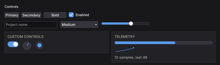
Find a widget by task
| You need… | Read |
|---|---|
| Buttons, menus, checkboxes, toggles, radios, selects, combo boxes, sliders, numeric fields, text fields, color pickers | Buttons, Menus & Inputs |
| Multi-line text, documents, undo history, IME-aware editing | Text Editing |
| Tabs, sortable tables, trees | Tabs, Tables & Trees |
| Modals, floating windows, popups, tooltips, context menus | Overlays & Windows |
| Drag-and-drop, tab reordering, dockable pane grids | Drag & Drop |
| Knobs, switches, progress bars, spinners, sparklines, canvas drawing | Custom Drawing & Controls |
| Colors, themes, interaction states, fonts | Styling & Theming |
| Live examples of every styling modifier | Interactive Styling Lab |
| Non-obvious styling behavior | Styling Gotchas |
Containers (row, column, grid, panel, card, layers, …) and sizing are covered once in Layout & Scrolling.
How widget names work
The same four forms appear across the library:
| Form | Meaning |
|---|---|
button "Save" | Base form. Returns Bool (activated) or () |
button' | Primed form. Returns a Response |
buttonWith (fixedW 120) | Takes a Layout -> Layout modifier first |
buttonConfigured cfg | Takes a config record; every config has a default...Config |
A Response carries identity and interaction state:
| Field / helper | Meaning |
|---|---|
respId | The widget’s WidgetId (focus, menus, scroll targets) |
respRect | The widget’s rectangle from the previous frame |
respHovered | Pointer is over the widget |
respPressed | Held down, not yet released |
respClicked | Activated: left click, Enter, or Space |
respChanged | The value was edited |
respSubmitted | Committed, for example Enter in a text field |
respHeldWith / respClickedWith | Which MouseButton is held / clicked |
respRightPressed / respRightClicked | Secondary-button variants |
Anything with a Response can be passed to tooltip, contextMenu, and the focus helpers.