Layout & Scrolling
Every container takes its layout as an argument: row and column take a layout, and rowWith/columnWith take a Layout -> Layout function first. Modifiers compose with (.), and when two set the same property, the leftmost wins.
settingsPanel :: NanoUI ()
settingsPanel =
  columnWith (gap 8 . padAll 12 . fillW) $ do
    label "Settings"
    whenM (buttonWith (fixedW 120) "Apply") apply
Logical pixels, origin top-left, y downward. Backends handle DPI scaling.
Each example below expands to its code and the frame it renders. The frames add padAll 14 and fill the window so the spacing shows.
Containers
A container wraps a NanoUI block and arranges the widgets it draws. The plain form (row) uses the inherited layout; the ...With form takes a modifier function.
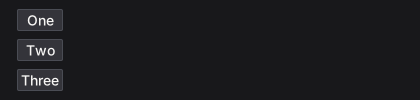
row / rowWith: children left to right
rowExample =
  rowWith (gap 8) $
    mapM_ (void . button) ["One", "Two", "Three"]

column / columnWith: children top to bottom
columnExample =
  columnWith (gap 8) $
    mapM_ (void . buttonWith fillW) ["One", "Two", "Three"]
grid / gridWith: rows of equal columns
gridExample =
  gridWith 3 (gap 8 . fillW) $
    mapM_
      (\i -> void (buttonWith fillW ("Cell " <> T.pack (show (i :: Int)))))
      [1 .. 6]

panel / panelWith: a styled surface
panelExample =
  panelWith (fixedW 300 . padAll 12 . gap 6) $ do
    heading "Deployments"
    muted "3 services running"

card: a full-width panel with a minimum width
cardExample =
  card $ do
    heading "Build #482"
    muted "Passed in 1m 42s"

callout: a panel tinted by a semantic colour
calloutExample = do
  warnCol <- themeWarning <$> uiTheme
  callout warnCol $ do
    heading "Certificate expiring"
    muted "TLS certificate expires in 3 days."

layers: children stacked in one box, later on top
layersExample =
  layers $ do
    let badgeRed = colorRGB 204 64 64
    void (buttonWith (fixedWH 170 40) "Inbox")
    styled (panelStyle (background badgeRed . borderColor badgeRed)) $
      panelWith (alignEnd . alignTop . padXY 6 1) $
        labelWith (fontColor colorWhite) "3"

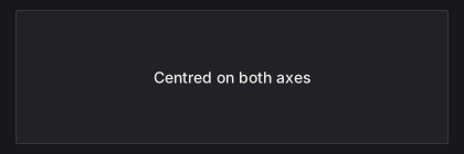
center: content centred on both axes
centerExample =
  panelWith (fillW . fillH) $
    center (label "Centred on both axes")
responsive / responsiveRowCol: one layout when wide, another when narrow
responsive breakpoint wide narrow body picks a container by window width; responsiveRowCol is the common row/column pair.
responsiveExample =
  responsiveRowCol 640 (tight . gap 8 . fillW) $ do
    panelWith (fillW . padAll 12) (label "Sidebar")
    panelWith (fillW . padAll 12) (label "Content")
A 420 px window:
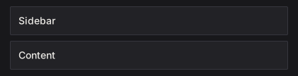
The same view at 760 px:

mouseArea: hover and clicks for a whole region
mouseAreaExample = do
  (_, area) <-
    panelWith fillW $
      mouseArea (fillW . padAll 10 . gap 4) $ do
        label "build.log"
        muted "Click anywhere in this card"
  when (respClicked area) (muted "opening build.log")

separator: a one-pixel rule
separatorExample =
  columnWith (fillW . gap 8) $ do
    label "Above the rule"
    separator
    label "Below the rule"

spacer: flexible space between siblings
spacerExample =
  rowWith (fillW . alignMid) $ do
    label "Left"
    spacer (Grow 1) Fit
    label "Right"

Modifiers
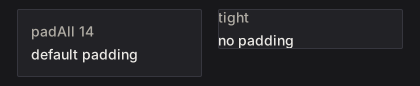
Modifiers are Layout -> Layout functions, so they chain with (.). The leftmost wins when two set the same property, so tight . padAll 14 has no padding while padAll 14 . tight keeps it.
Sizing
fillW: take all remaining width
fillWExample =
  rowWith (fillW . gap 8) $ do
    void (buttonWith (fixedW 110) "fixedW 110")
    void (buttonWith fillW "fillW")

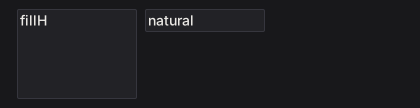
fillH: take all remaining height
fillHExample =
  rowWith (fillW . gap 8 . fixedH 96) $ do
    panelWith (fixedW 120 . fillH) (label "fillH")
    panelWith (fixedW 120) (label "natural")
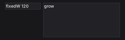
grow: fill both axes (fillW . fillH)
growExample =
  rowWith (grow . gap 8) $ do
    panelWith (fixedW 120) (label "fixedW 120")
    panelWith grow (label "grow")
fixedW: an exact width
fixedWExample =
  rowWith (gap 8) $ do
    void (buttonWith (fixedW 60) "60")
    void (buttonWith (fixedW 110) "110")
    void (buttonWith (fixedW 170) "170")

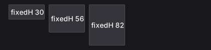
fixedH: an exact height
fixedHExample =
  rowWith (gap 8 . fillW) $ do
    void (buttonWith (fixedH 30) "fixedH 30")
    void (buttonWith (fixedH 56) "fixedH 56")
    void (buttonWith (fixedH 82) "fixedH 82")
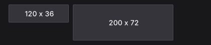
fixedWH: an exact width and height
fixedWHExample =
  rowWith (gap 8) $ do
    void (buttonWith (fixedWH 120 36) "120 x 36")
    void (buttonWith (fixedWH 200 72) "200 x 72")
minW: a lower width bound
minWExample =
  rowWith (fillW . gap 8) $ do
    void (buttonWith (minW 200) "minW 200")
    void (button "natural")

maxW: an upper width bound
maxWExample =
  rowWith (fillW . gap 8) $ do
    void (buttonWith (fillW . maxW 160) "maxW 160")
    void (buttonWith fillW "fillW")

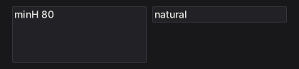
minH: a lower height bound
minHExample =
  rowWith (fillW . gap 8) $ do
    panelWith (minH 80 . fillW) (label "minH 80")
    panelWith fillW (label "natural")
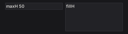
maxH: an upper height bound
maxHExample =
  rowWith (fillW . gap 8 . fixedH 100) $ do
    panelWith (maxH 50 . fillW) (label "maxH 50")
    panelWith (fillW . fillH) (label "fillH")
percent: a percentage of the parent's width
percentExample =
  rowWith (fillW . gap 8) $ do
    panelWith (percent 30) (label "percent 30")
    panelWith (percent 60) (label "percent 60")

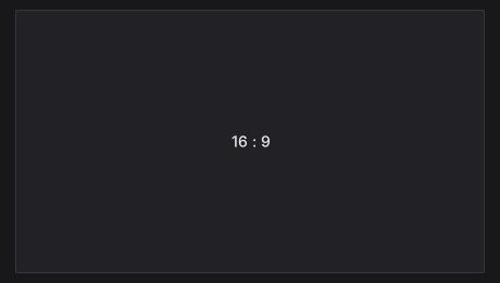
aspect: keep a width / height ratio
aspectExample =
  panelWith (fillW . aspect (16 / 9)) $
    center (label "16 : 9")
Spacing
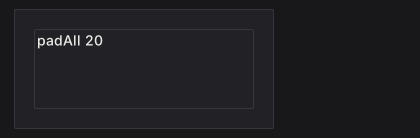
padAll: equal padding on all four edges
padAllExample =
  panelWith (fixedWH 260 120 . padAll 20) $
    panelWith (fillW . fillH) (label "padAll 20")
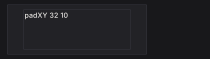
padXY: horizontal, then vertical, padding
padXYExample =
  panelWith (fixedWH 280 100 . padXY 32 10) $
    panelWith (fillW . fillH) (label "padXY 32 10")
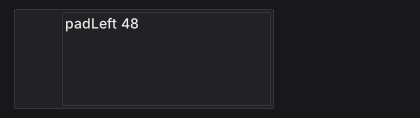
padLeft: left padding
padLeftExample =
  panelWith (fixedWH 260 100 . padLeft 48) $
    panelWith (fillW . fillH) (label "padLeft 48")
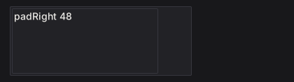
padRight: right padding
padRightExample =
  panelWith (fixedWH 260 100 . padRight 48) $
    panelWith (fillW . fillH) (label "padRight 48")
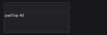
padTop: top padding
padTopExample =
  panelWith (fixedWH 260 120 . padTop 40) $
    panelWith (fillW . fillH) (label "padTop 40")
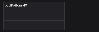
padBottom: bottom padding
padBottomExample =
  panelWith (fixedWH 260 120 . padBottom 40) $
    panelWith (fillW . fillH) (label "padBottom 40")
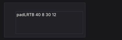
padLRTB: left, right, top, bottom padding
padLRTBExample =
  panelWith (fixedWH 280 120 . padLRTB 40 8 30 12) $
    panelWith (fillW . fillH) (label "padLRTB 40 8 30 12")
gap: space between children
gapExample =
  columnWith (fillW . gap 12) $ do
    rowWith (gap 4) $ mapM_ (void . button) ["gap 4", "B", "C"]
    rowWith (gap 24) $ mapM_ (void . button) ["gap 24", "B", "C"]

tight: remove container padding, keep the gap
tightExample =
  rowWith (gap 16 . fillW) $ do
    panelWith (padAll 14 . gap 6 . fillW) $ do
      muted "padAll 14"
      label "default padding"
    panelWith (tight . padAll 14 . gap 6 . fillW) $ do
      muted "tight"
      label "no padding"
Alignment and wrapping
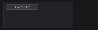
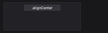
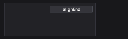
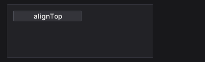
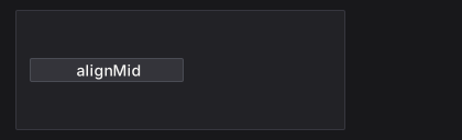
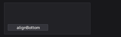
alignStart, alignCenter, and alignEnd place a child across a column. alignTop, alignMid, and alignBottom place it down a row. An alignment modifier positions the node it is applied to inside its parent. alignMid on a row moves the row; to centre the row’s children, put alignMid on each child.
alignStart: the left edge
alignStartExample =
  panelWith (fixedWH 300 110 . padAll 10) $
    void (buttonWith (alignStart . fixedW 140) "alignStart")
alignCenter: the horizontal centre
alignCenterExample =
  panelWith (fixedWH 300 110 . padAll 10) $
    void (buttonWith (alignCenter . fixedW 140) "alignCenter")
alignEnd: the right edge
alignEndExample =
  panelWith (fixedWH 300 110 . padAll 10) $
    void (buttonWith (alignEnd . fixedW 140) "alignEnd")
alignTop: the top edge
alignTopExample =
  panelWith (fixedWH 300 110 . padAll 10) $
    rowWith (fillW . fillH . gap 8) $
      void (buttonWith (alignTop . fixedW 140) "alignTop")
alignMid: the vertical centre
alignMidExample =
  panelWith (fixedWH 300 110 . padAll 10) $
    rowWith (fillW . fillH . gap 8) $
      void (buttonWith (alignMid . fixedW 140) "alignMid")
alignBottom: the bottom edge
alignBottomExample =
  panelWith (fixedWH 300 110 . padAll 10) $
    rowWith (fillW . fillH . gap 8) $
      void (buttonWith (alignBottom . fixedW 140) "alignBottom")
alignBaseline: share the first baseline
alignBaselineExample =
  rowWith (gap 12 . fixedW 340) $ do
    labelWith (fontSize 24 . alignBaseline) "Title"
    labelWith alignBaseline "baseline text"

wrap: start a new line when a child does not fit
wrapExample =
  rowWith (wrap . gap 6 . fixedW 280) $
    mapM_ (void . button) ["haskell", "immediate", "mode", "layout", "sdl", "widgets"]

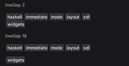
lineGap: space between wrapped lines
lineGapExample =
  columnWith (fillW . gap 16) $ do
    let labels = ["haskell", "immediate", "mode", "layout", "sdl", "widgets"]
    muted "lineGap 2"
    rowWith (wrap . lineGap 2 . gap 6 . fixedW 280) $ mapM_ (void . button) labels
    muted "lineGap 18"
    rowWith (wrap . lineGap 18 . gap 6 . fixedW 280) $ mapM_ (void . button) labels
lineAlign: align wrapped lines in the container
lineAlignExample =
  rowWith (wrap . lineAlign LinesCenter . gap 6 . fixedW 210) $
    mapM_ (void . button) ["alpha", "beta", "gamma", "delta", "epsilon"]

Positioning and pointer behavior
pinAt takes a child out of the flow. pointer sets whether an overlapping region consumes pointer events (PointerBlock) or passes them to what is underneath (PointerPass). The pointer examples park the pointer over the overlay.
pinAt: position absolutely inside the parent
pinAtExample =
  panelWith (fixedWH 280 110 . padAll 12) $ do
    heading "Inbox"
    muted "The badge is pinned, not stacked."
    let badgeCol = colorRGB 204 64 64
    styled (panelStyle (background badgeCol . borderColor badgeCol)) $
      panelWith (pinAt 6 (-6) . alignEnd . alignTop . padXY 6 1) $
        labelWith (fontColor colorWhite) "12"

pointer PointerBlock: consume pointer events over a region
pointerBlockExample =
  layers $ do
    void (buttonWith (fixedWH 200 44) "Open logs")
    styled (panelStyle (background (colorRGBA 0 0 0 150) . borderWidth 0)) $
      panelWith (pinAt 0 0 . grow . pointer PointerBlock . padAll 6) $
        muted "scrim"

pointer PointerPass: let pointer events through
pointerPassExample =
  layers $ do
    void (buttonWith (fixedWH 200 44) "Open logs")
    labelWith (pinAt 8 (-6) . pointer PointerPass) "decorative label"

Scrolling
A scroll container needs a bounded viewport on its scrolling axis:
itemList :: [Text] -> NanoUI ()
itemList items =
  scrollWith (fixedH 300 . fillW) $
    column $ for_ items label
Without a bounded ancestor, grow can leave a scroller with nothing to size against.
scrollWithreturns the body’s result.scrollAreaalso returns the scroller’sWidgetId, for programmatic control.scroll2DWith/scrollArea2Dscroll both axes.- A scroller that fills both axes (
grow) drops its well and paints the page background (pageBackground,themeWindowby default). Scope a view instyled panelPagefor a page on the panel surface.
Virtualization
For 10,000+ rows, build only the visible slice and use spacers for the rest. Capture the scroller id and read the previous layout with getScrollMetricsUi:
virtualizedList :: [Item] -> NanoUI ()
virtualizedList items = do
  sid <- currentId
  scrollWith (fixedH 500 . fillW) $ do
    metrics <- getScrollMetricsUi sid
    let rowH = 28
        total = length items
        (offsetY, viewH) = case metrics of
          Nothing -> (0, 0)
          Just m  -> (v2Y (scrollOffset m), rectH (scrollViewport m))
        firstVisible = max 0 (floor (offsetY / rowH))
        lastVisible  = min total (firstVisible + ceiling (viewH / rowH) + 2)
        topH    = fromIntegral firstVisible * rowH
        bottomH = fromIntegral (total - lastVisible) * rowH
        visibleRows = take (lastVisible - firstVisible) (drop firstVisible items)
    columnWith (tight . fillW) $ do
      when (topH > 0) (spacer Fit (Fixed topH))
      for_ visibleRows $ \item ->
        withKey (itemId item) $
          labelWith (fixedH rowH . fillW) (itemTitle item)
      when (bottomH > 0) (spacer Fit (Fixed bottomH))
scrollViewport excludes padding and the scrollbar lane; use it instead of the container rectangle for the visible height. scrollOffset is the current offset. The metrics read registers a layout dependency, so a resize triggers another frame.
See packages/nano-ui-demo/examples/LongList.hs (100,000 rows) and Logs.hs (sticky-to-bottom).
Programmatic scrolling and wheel tuning
reveal :: WidgetId -> Float -> Int -> Bool -> NanoUI ()
reveal sid rowH index shouldReveal =
  when shouldReveal $
    scrollRectIntoViewUi sid (Rect 0 (fromIntegral index * rowH) 1 rowH) ScrollNearest ScrollInstant
From a view: scrollToUi, scrollByUi, scrollPagesUi, scrollRectIntoViewUi, setScrollOffsetUi, setScrollStepUi. The Context variants (scrollTo, getScrollOffset2D, …) are for IO.
One wheel notch scrolls 60 logical pixels by default. For fixed-height rows, set the step so a notch is one row (askContext is in NanoUI.Monad):
oneRowPerNotch :: Float -> NanoUI ()
oneRowPerNotch rowHeight = do
  ctx <- askContext
  liftIO $ setScrollTuning ctx defaultScrollTuning
    {scrollWheelStep = rowHeight, scrollSmoothTime = 0}
setScrollStepUi sid px overrides one scroller; 0 restores the context step.
Nesting and chrome
scrollArea, panel, and card each draw a background, border, and radius. Nesting them inside a popup or dialog draws a box in a box. Draw the chrome at one level only: flatten the inner surface with styled (inputStyle (background colorTransparent . borderWidth 0)), or give the outer dialog padAll 0 and pad the inner body.
See Styling Gotchas and Troubleshooting for the recurring cases.