Tabs, Tables & Trees
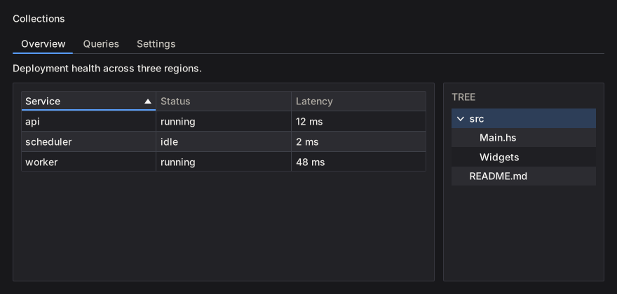
Tabs
A tab strip binds the active key to a Var; only the selected tab’s body runs:
data Page = Overview | Logs | Settings
  deriving (Eq, Show, Enum, Bounded)

pages = do
  page <- useEnumVar Overview
  boundedTabs (T.pack . show) page $ \case
    Overview -> overviewView
    Logs     -> logsView
    Settings -> settingsView
tab creates a plain header; closableTab adds a close button and reports the close through the primed response:
closableTabs = do
  active <- useVar ("overview" :: Text)
  resp <- tabs' active
    [ closableTab "overview" "Overview" overviewView
    , closableTab "logs" "Logs" logsView
    ]
  for_ (tabClosed resp) closeTab
tabs' reports tabClosed and leaves the tab in place; the caller removes it from its list. A key no tab has selects the first tab and writes that key back to the Var.
tabBar / tabBar' draw headers only and leave the body to the caller. tabsConfigured / tabBarConfigured take a TabsConfig:
segmented :: Var Text -> [Tab Text (NanoUI ())] -> NanoUI ()
segmented active docTabs =
  let cfg = defaultTabsConfig
        {tabsStyle = TabSegmented, tabsOrientation = TabTop, tabsTrailing = newTabButton}
   in tabsConfigured cfg active docTabs
The four TabStyles, with a different tab selected in each:
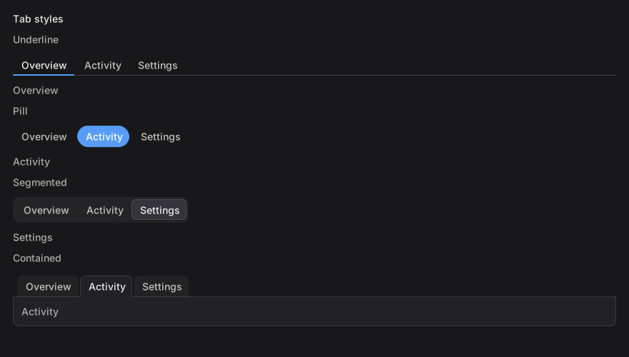
| Style | Header treatment |
|---|---|
TabUnderline | Headers on a rule; the selected header has an accent bar |
TabPill | The selected header is filled with the accent color |
TabSegmented | Headers sit in a rounded track; the selected one is raised |
TabContained | Folder tabs; the selected header opens onto a bordered body |
Placements: TabTop, TabBottom, TabLeft, TabRight. boundedTabs / boundedTabBar generate a tab per enum value.
Tables
table renders Colonnade columns. Header clicks sort through a Var SortCol:
data Process = Process
  { pid :: Int
  , name :: Text
  , mem :: Int
  }

processTable :: [Process] -> Var SortCol -> NanoUI ()
processTable procs sortVar =
  table "procs" cols procs sortVar
  where
    cols = mconcat
      [ headed "PID" (T.pack . show . pid)
      , headed "Name" name
      , headed "Memory (MB)" (T.pack . show . mem)
      ]
SortCol holds the active column and direction. simpleTable headers rows renders a table of text rows. table' returns a TableResponse with the updated sort, column order, and hidden columns; tableConfigured adds frozen rows/columns, fixed column widths, and hidden columns through TableConfig. Rows are virtualized internally.
Cell helpers: textCell, cellWidget, widgetCell, and Cell with an explicit sort key (cellKey). A cell with a widget view still needs cellText if its natural width should be measured.
Trees
items :: [TreeItem]
items =
  [ TreeItem "src" [TreeItem "Main.hs" [], TreeItem "Widgets" []]
  , TreeItem "README.md" []
  ]

fileTree :: [TreeItem] -> Var Int -> NanoUI ()
fileTree = tree "file-tree"
tree takes the library’s TreeItem type (treeItemLabel, treeItemChildren). The Var Int holds the selected item’s pre-order index. Build the index in the same pre-order when you need to map a selection back to an item. Collapsed nodes keep their state; rows are drawn as focusable buttons and support arrow-key navigation.
For large trees, keep the expansion set in a VarMap keyed by a stable path, and rebuild the visible items before calling tree.
To reorder tabs by dragging, see Drag & Drop.